2 extra stages for my flash bullying game. Due to space issues I've decided that the multiple choice function will now operate within a 'choice box' which is the light green window with white text within it. Selections can also be made by clicking the individual characters, e.g click the teacher character to 'Tell the teacher' and click the bully to 'tell the boy not to be mean'. The background images for each scenario are photoshopped photographed, adding colour and contrast to brighten/jazz up the appearance of the game to make it appealing to kids.
Saturday, 31 October 2009
Friday, 30 October 2009
Propaganda Idea Progression
Just a few ideas I'm playing around with for these propaganda images. Kind of a back to traditional methods of communication. Surely old school theatre is better than youtube. People being entertained by people, by our very nature of being human, we should be around each other in the flesh. Not behind a camera lens.
You are not your profile picture.
"Shakespeare wasn't on facebook, What a loser"
This image represents the current day attitude towards people who actively participate in social networking sites. Although it could be argued Shakespeare in his time was in fact an ambassador for social change, acting/plays being some sort of fictional entertainment.
Social networking sites I feel do not encourage anything apart from fueling an obsession with digital representations of ones self. We are not digital, flesh and bones people.
Thursday, 29 October 2009
Bullying flash game
Friday, 23 October 2009
A day in the life of - Limbs!
After spitballing ideas with Oli, a day in the life of your limbs seems to be what we are rolling with. An interesting perspective I think, and we've come up with point of view POV shot from the eyes, ear, mouth, teeth, nose, elbows, hands, buttocks, knee, feet and ankle.
As it is 'a day in the life of' we are going to set a story line to go with the shots, a normal day, attending university, walking through town etc. But with varied shot lengths, and angles we are hoping to create a sense of drama in a situation you would normally expect to be mundane & boring.
If there is enough time we are hoping to add music, possibly some sound effects and basic visual transitions.
Currently working on a shot list so...there that is!
Oh! And the image here has been made using some program called POV (not by me), a word of warning, make sure you have your google filter turned on if you are going to search POV!!
Propaganda Idea
Fuck facebook indeed. In a world that now pretty much couldn't survive without the internet/mobile phones/tv. I've decided to tackle the issue that technology is desensitizing people.
People text instead of talking
MSN instead of talking
Facebook instead of printing photographs
On-line dating - seriously?
E-mail instead of hand written letters
E-cards instead of birthday cards
These things are important. Life is out there, not here on this screen. Take the screen away, you've got millions of lonely people, sat still in a room, tapping pieces of plastic.
Tuesday, 13 October 2009
Website Wireframe
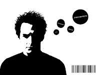
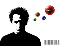
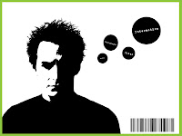
My first idea for my portfolio website. I'm working mainly in my sketchbook now, so this was my first digital working on my idea. I've noted from my sketch to digital form : Intended symbols are not implemented, instead replaced with text : Barcode should be replaced with artists signature to emphasize multi-discipline areas I've experienced : Large px stroke could frame the page better, although seems almost poster like suggesting a strong graphic design influence.
Monday, 12 October 2009
Alphabet Soup
Illustrator
Subscribe to:
Posts (Atom)