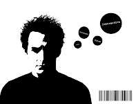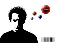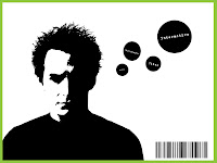


My first idea for my portfolio website. I'm working mainly in my sketchbook now, so this was my first digital working on my idea. I've noted from my sketch to digital form : Intended symbols are not implemented, instead replaced with text : Barcode should be replaced with artists signature to emphasize multi-discipline areas I've experienced : Large px stroke could frame the page better, although seems almost poster like suggesting a strong graphic design influence.
No comments:
Post a Comment